
The world of internet is continuously developing and evolving itself into the expansion of smartphones and tablets. This change increases the designing ability to become responsive and create brand value in all the browsing mediums. For this purpose designing, for various devices, is not easy and take much of the efforts and time to do so. It also needs to have the responsive website design which results in overwhelming results. This piece of content focuses on the mobile web design through various approaches to make it work for your business.

- Keep It Simple
Your aim is to get your message across the target audience. For this purpose you need to edit your website content for the mobile phone version in several ways. This way the web designer and the developer make an impact with the elements delivering it with simplicity for easy and quick understanding. It ends the use of unnecessary scrolling and keeps up with the quick and instantaneous pace of the mobile phone world.
- Vertical Overflow
One of the intimidating aspects of the mobile web design is the small screen size. This is relieved intellectually with the vertical overflow meeting the mobile design as the scroll design instead of a small rectangular design. The designer thinks about the page flows instead of fitting the screen with the design.
- Executing Typography
Simple design palette calls for simple and easy execution when the designer needs to pay attention details. With responsive design, the screen space is consumed with copy instead of typographic execution. This is why content legibility is of utmost importance. The designer needs to continuously read the design text to maintain the legible point size with comfortable count of words per line. Using analogy means the designer needs to continually read the text.
- Coding
Coding is important as it brings incredible advantage to the design. Coding gives the designer the confidence of handling the client when he knows the looks and works of mobile phone. Coding connects the designers and the web coders, working in a team to control the looks and working of the website design.
Summing Up
Though the responsive websites have less content than desktop ones, this doesn’t mean that the designing process is simplified. On the contrary, the details and execution need more care and attention.


 HTML Sitemap
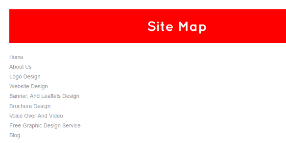
 it is a small image which appears on the browser tab and also in an RSS reader so have a large square and then scale it down, save it in a jpg format and then using a Favicon generator turn the file into an .ico.

 We create professional web interfaces that will suit your purposes to the best, after a comprehensive survey of your clients both potential and existing. After all everyone should understand their client’s problems with clear details and from the very beginning work on a focal factor of making your business concept clear to them via creative, informative websites.
 Such logos have the value to create a long-lasting impact on the consumers mind, they are synonymous with your company, and it is that one sign that will differentiate you from the rest of the brands and your customers.
 Smart and custom-made logos have the power to make a favorable effect on the minds of people. You just can’t ignore your business logo when you need to achieve success.
 Logos Design